# Build Your First App
In this step, we will create your very first app.
# Login
First, open your AppDesigner by clicking the AppDesigner icon in the navigation bar of your IoTHub. You can login to the AppDesigner and AppHub with the same email and password that you use in the IoTHub. Normally you are automatically logged in to the AppDesigner if you were already logged in to IoTHub.
# Create Your App
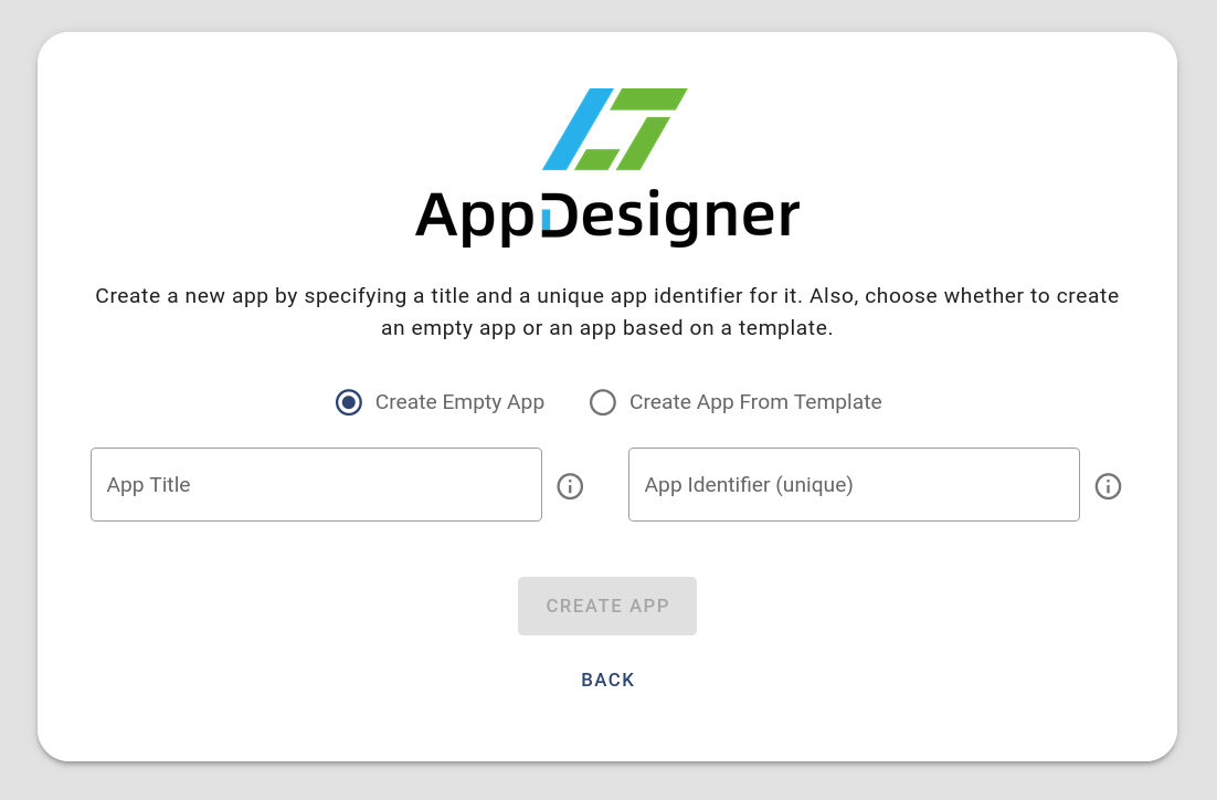
After that you will be forwarded to the main menu. Please click the button that says Create App. On the next screen, you need to enter an app title as well as a unique app identifier. The users of your app will only see the app title in the UI. The app identifier is only used to uniquely identify your app and can not be changed after creating the app. First, make sure that the Create Empty App option is selected. If you want to know more about the Create App From Template option, please refer to this page. Then fill in the two fields as shown in the screenshot and click Create App.
# App Editor
When your app was successfully created, you will now see the app editor. The UI consists of the three parts that are described in the following. Please read the descriptions and do not click anything, yet. We will come to the interactive part soon!
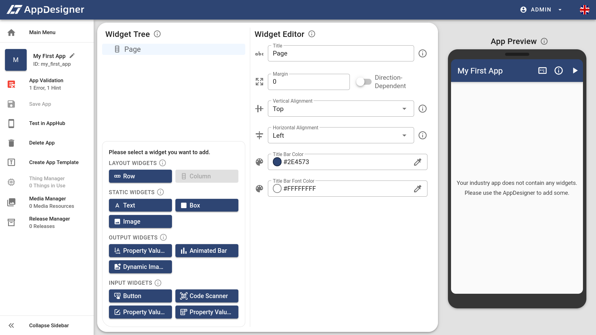
# 1. The Widget Tree
The Widget Tree on the left is used to add, move or delete widgets. Initially, it only contains the non-deleteable Page. On the bottom you can find the add widget panel which allows adding new widgets to the tree.
# 2. The Widget Editor
The Widget Editor on the right side of the Widget Tree allows you to edit the attributes of the widget which is currently selected. Each widget type has different attributes. Initially, the Page is selected and therefore, its attributes are displayed.
# 3. The App Preview
The App Preview on the right always shows the current state of your app. It will automatically update once you add widgets to the UI.
These short descriptions of the AppDesigner UI should be sufficient for creating your first app now. If you want to know more about the app editor later, please refer to this page. For now, let's design the UI of your first app.
# Adding Widgets to the UI
The app we want to create will consist of a text widget with a welcome message and of your favorite image. The following sections explain how to add and configure these two widgets.
# Text Widget
Therefore, we click on the Text button () in the add widget panel. After the text widget was added to the Widget Tree, it is automatically selected and its attributes are displayed in the Widget Editor.
The first attibute you should change is the Text () attribute at the bottom of the Widget Editor. Type in your welcome message here, for example Welcome to my new AppDesigner app!. You will see that the text does not look perfect, yet. This is because the size of the text widget is too small. Therefore, click on the Full Width switch next to the Width () attribute. Now, the text should use all available space! You can also use the Widget Editor to change the alignment, make the text bold, italic, large or underline it. Just be creative!
# Image Widget
Now it is time to add our image widget. Therefore, select the Page in the Widget Tree and click the icon to open the add widget panel again. Then, click on the Image button () to add the widget to the tree. Again, the new widget is automatically selected and you can now edit it in the Widget Editor.
Change the Width () and the Height () attributes of the image to 200. If you try to want to select a value in the Image selection () below, the list is empty. We need to use the Media Manager to add one first.
To add an image, please click on Media Manager () in the sidebar on the left of the AppDesigner. A new window will open up. Click on Add Media File, select an image from your computer and give it a title such as My Favorite Image. Then, click the Add Media File button () below the form and close the media manager using the button in the top right as soon as the image is uploaded.
Now that the image is uploaded, you can select it as the Image attribute () in the Widget Editor. You should now see it in the App Preview.
# Positioning the Widgets
The two widgets are now displayed below each other at the top of your app. In this step, we will arrange them more nicely. To better understand what is happening, you can enable the debug lines by clicking the Debug Lines icon ().
To position the new widgets, we need to configure the Page in the Widget Editor. The two attributes that are important to us are Vertical Alignment () and Horizontal Alignment ().
The Vertical Alignment tells the Page where to position its children vertically. Try out the different values and see what is happening in the App Preview. A good value to select is Space Around.
The Horizontal Alignment tells the Page where to position its child widgets horizonally. Again, try out what happens when you select the different values. A good value to select is Center.
# Your First App Is Complete
Congratulations, you just finished your first app. To not lose any data, click on Save App () in the sidebar on the left of the AppDesigner (or press CTRL+S). Then, display the QR code of the app by clicking Test in AppHub () in the sidebar.
This code can be scanned using the ELCO AppHub. The next steps of this guid will explain what the AppHub is and how you can install it on your smartphone.