# Widgets
Widgets are the central building blocks of any app created with the AppDesigner. We distinguish between four different widget categories. Layout Widgets primarily serve as containers for other widgets. Static Widgets represent static content, Output Widgets represent dynamic content depending on data from the IoTHub. In contrast, Input Widgets can be used to manipulate data on the IoTHub.
# Common attributes
All widgets share a set of common attributes, that can be edited using the widget editor.
Title: The title attribute won't be visible in the app and is only used to identify the widget in the widget tree.
Margin: The margin value is used to create space around widgets. It can have an individual value for all four directions (top, right, bottom, left) or one value which is applied to all sides equally.
# Layout Widgets
Unlike the other widget categories, layout widgets are not directly visible. They merely serve as containers to group their child widgets. Currently, there are three types of layout widgets used in the AppDesigner: Page, Row and Column.
# Alignment of Child Widgets
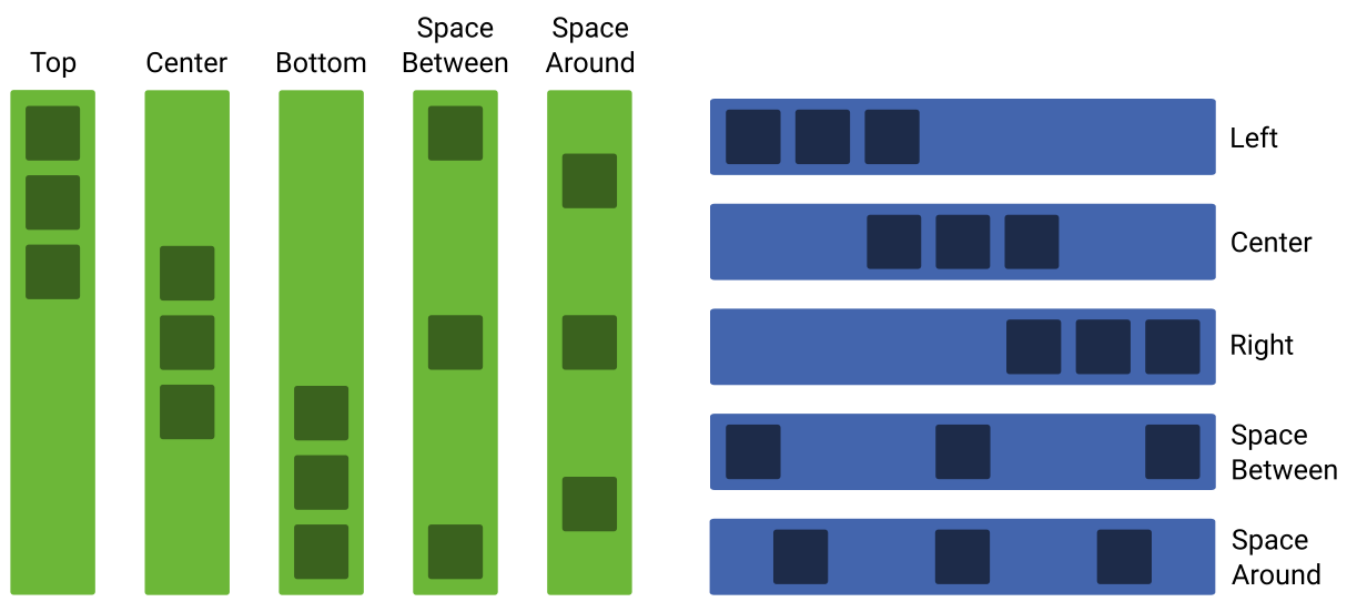
Since they are used to group other widgets, layout widgets can specify how their child widgets should be aligned along the horizontal and vertical axis. As you can see on the image above, you can choose between several values for the alignment.
Using Center, Top, Bottom, Left or Right, the elements are placed at the beginning, at the end or in the center of the layout widget. Space Between ensures that the spacing between the elements is equally distributed. With Space Around, each element gets individually the same spacing on both sides.
Note: Depending on the selected layout widget and its level in the widget tree, only certain values or alignment specifications are permitted. Details can be found in the following sections on the individual widgets.
# Page
Every new app initially has exactly one page. It contains all the widgets and can not be deleted or added manually. It aligns its child widgets above each other, like a column widget. You can specify, how the contained widgets should be aligned and distributed along the horizontal as well as along the vertical axis. Furthermore the page allows you to define custom colors (font and background) for the app's title bar.
# Row
The row widget can only be added as a direct child of the the page or inside a column widget. It aligns its children next to each other. Rows that are direct children of the page wrap to the next line if the available space is exceeded. For all row widgets you can specify how the child widgets should be aligned and distributed along the vertical axis. For row widgets, that are direct children of the page, you can also specify the horizontal alignment.
# Column
Column widgets align their child widgets above each other. They can only be placed inside row widgets. You can only specify how the contained widgets should be aligned and distributed along the horizontal axis.
# Static Widgets
Static widgets are not linked to data from the IoTHub. They are intended to display content that is specified while creating the app and won't change while using the app. Currently these static widgets comprise the Text, Image and Box widget.
# Text
A simple widget that is used to display a static text. Consequently it is well suited for creating headlines, labels or information texts. Text widgets have various options to change their visual appearance as it is also common in text editing programs.
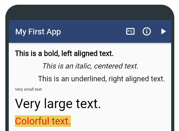
You can select between five predefined font sizes and define whether the text alignment should be left, centered or right. Furthermore, you can use italic, bold and underlined text style as you like. When placed as a direct child of the page , you can choose between defining a specific width of the text widget and making it full width. This option is not available for text widgets that are children of a row or column widget. In this case, you have to specify the exact width. If you want to display dynamic data from the IoTHub in a text widget, the Property Value Text widget is what you are looking for.
# Box
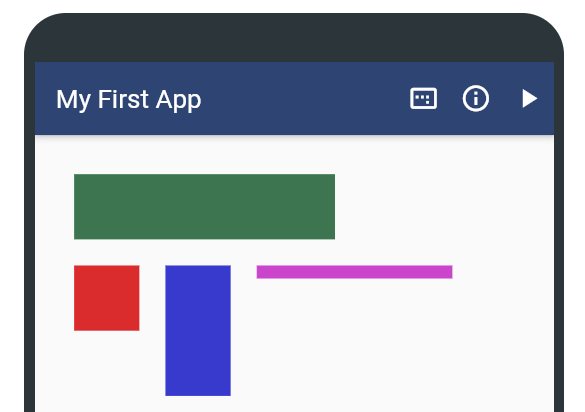
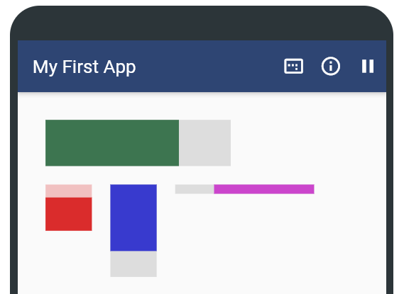
The box widget represents a simple static square. Besides an individual width and height, a background color can be selected for the widget. There is also a dynamic variant of this widget that changes its size depending on a Property value: the Animated Bar widget.
# Image
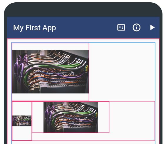
Image widgets are used to display static images in the app. An individual width and height can be defined for the widget. Keep in mind, that the image won't be cropped to that size. If the entered width to height ratio does not fit the one of the image, there will be some blank space (see image below). And of course, the corresponding image must be specified. Therefore, it must first be uploaded in the Media Manager. Then it can be selected in the app editor via a selection box for the image widget. If you want to change the displayed image depending on specific data from the IoTHub, use the Dynamic Image widget.
# Output Widgets
Unlike static widgets, output widgets can change their content or appearance at app runtime accoring to the current value of a Property on the IoTHub. Currently there are three output widgets: Property Value Text, Animated Bar and Dynamic Image.
# Property Value Text
If you just want to display the current value of a Property from the IoTHub in textual form, the Property Value Text widget is the way to go. First of all, it has the same features as the static Text widget. In addition, a Property must be selected to display its value at runtime. If there is currently no data available from the IoTHub, a placeholder text can be specified. Moreover, a unit can optionally be specified. For Properties of type float you can also specify how many decimal places should be displayed.
# Animated Bar
Based on the box widget, the animated bar widget additionally offers the possibility to fill this box proportionally depending on the current value of a Property. How much this bar is filled depends on the current value of the selected Property on the IoTHub. To calculate this, a minimum and maximum value must be entered. The bar is empty if the current value of the Property is smaller than or equal to the given minimum value. Similarily, the bar is completely filled, if the current value is larger than or equal than the given maximum value. Besides the attributes of the box widget, a second color value for the unfilled area of the bar can be defined. Furthermore, a bar direction can be selected. It defines whether the filled area of the bar should grow from left to right, from right to left, from top to bottom or from bottom to top. If you want the foreground color of the bar to change depending on the current Property value, you can also add up to ten different dynamic color ranges. For these, a color and the respective minimum and maximum value must be specified. To clearly delimit the color ranges from each other, you can also define whether the individual values should be included in the color range or not.
# Dynamic Image
The dynamic image behaves like the normal image widget. However, it allows exchanging the displayed image if the selected Property meets a certain condition. To define such conditions, a comparator and a compare value must be entered. Also, of course, the alternative image must be selected. Keep in mind, that images must first be uploaded via the Media Manager. Important: If multiple conditions are met at runtime, the image of the first condition that is met will be displayed. Hence, it is possible to prioritize the conditions via drag and drop.
# Input Widgets
While above described output widgets are primarily used to read (and display) data from the IoTHub, input widgets can be used to write data. The values to be written are either predefined in the AppDesigner (Button, Property Value Dropdown), or can be specified directly by the app user (Property Value Input). To provide feedback to the user, an individual info message can optionally be defined for each input widget. It is shown after the send button of the widget was clicked.
# Button
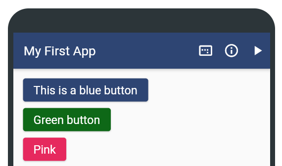
The button allows users to execute certain effects such as writing, incrementing or decrementing the value of a Property in the IoTHub or opening a link in a browser. The visual appearance of the button can be customized by selecting a button color as well as text color. It is also possible to specify whether the button should be disabled for a defined period of time after being clicked. The main task of the button widget is executing effects. You can add as many effects as you want to a button. Their order can be adjusted by dragging the corresponding effect to the desired location. Keep in mind, that clicking the button once will execute all effects that were attached to the button. Currently, there are three types of effects: Write Effect, Increment Effect and Open Link Effect. Write effects set the Property directly to the specified value. In contrast, an increment effect increments the current value of the Property by the defined value. If a negative value is specified for an increment effect, the Property value will be decremented. An open link effect opens a website in the mobile device's browser
# Code Scanner
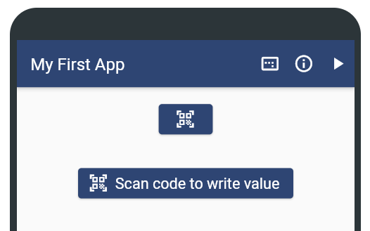
The code scanner widget allows users to assign a value to a Property by scanning a QR code. In the app's user interface, it looks like an ordinary button, which however launches a code scanner instead of executing effects. To distinguish it from button widgets, the code scanner button contains an additional QR code icon. Besides the visual appearance (colors, text), you can configure whether the value should be written directly after scanning or whether the user should additionally confirm this via a dialog.
# Property Value Input
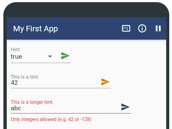
The Property Value Input behaves similar to a write effect of a button. However, the app users can decide themselves, what value should be written to the Property. The width of the widget, the color and an optional hint text can be defined in the widget editor. Furthermore, as with all input widgets, the target Property must be selected. Since only certain values or value ranges are permitted for the various Property types, the data entered via the widget is validated accordingly. If an invalid value is entered, a warning is shown and the send button cannot be tapped. For boolean Properties, the input field is replaced by a select menu with two values (true, false), since these are the only two possible boolean values. It is also possible to specify whether the send button should be disabled for a defined period of time after being clicked.
# Property Value Dropdown
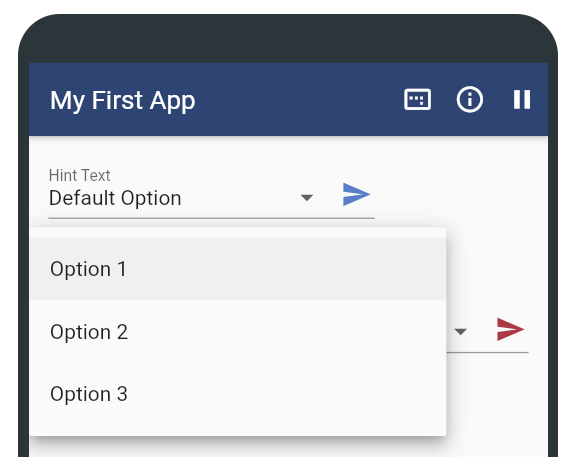
The Property Value Dropdown allows app users to select a value from a pre-defined set of so-called options. The selected value will be written to the respective Property after tapping the send button. Like for the Property Value Input widget, a hint text, the send button color and the width of the widget can be specified in the widget editor. And it is also possible to specify whether the send button should be disabled for a defined period of time after being clicked. For each of the dropdown options, a value and a label have to be defined. Only the latter is visible in the app at runtime. Also, one option can be marked as default. This option is then selected by default in the widget.
