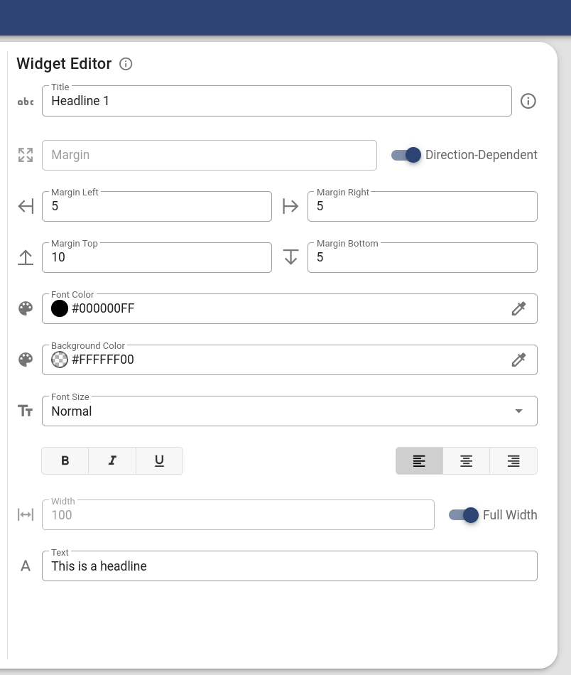
# Widget Editor
Besides the Widget Tree and the App Preview, the Widget Editor is one of the three main components of the app editor. Except for their exact position in the widget tree, all adjustments for the respective widget are made in the widget editor. In order to edit a widget, you first have to select it in the widget tree. The content of the widget editor always depends on the currently selected widget in the widget tree. For more details on the attributes of the different widget types, see the Widgets chapter. Most attributes can be edited via simple input or select UI elements. The more complex ones are explained below.
Note: The changes you make won't be saved automatically. To avoid possible data losses we recommend to regularly save the app via the save button () in the sidebar or by using the CTRL+S keyboard shortcut (or CMD+S on a Mac), especially before leaving the AppDesigner.
# Colors
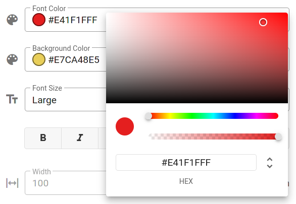
In order to adjust colors, e.g. the font color of a text widget or the background color of a button, the widget editor offers a color picker component (). Just click somewhere on the color input to display it. Using the color picker, you can adjust the color region via the first slider and the transparency of the color via the second slider. In order to pick the final color, click on the location on the color map at the top of the color picker dialog.
# Tooltips
Watch out for small info icons () in the widget editor. These icons usually hide a tooltip that displays additional information about the corresponding attribute or control. Hover the mouse cursor over the icon to display the information. Such tooltips are also available when UI elements are disabled. So if you want to know why a certain option is not available for the widget, move the mouse pointer over it.
# Validation
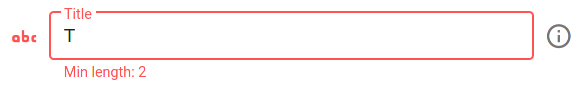
Most input fields in the widget editor are automatically validated as you type. If an invalid value is entered, a corresponding warning appears below the input field (see image below). Note that invalid values are discarded as soon as you switch to another widget. Furthermore, they won't be saved when you save the app.
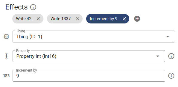
# Drag and Drop
Button effects and the options of a dropdown widget are visualized as small so-called chips (see image below). They can be sorted via drag and drop. To do this, the corresponding option or effect must be dragged to the appropriate position with the mouse button held down. Via the X icon you can trigger the deletion of an option or effect. In order to edit it, just click on the chip (outside the X icon). You will then see the needed input and control elements.