# App Preview
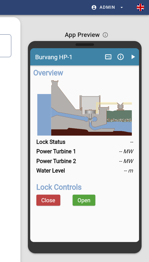
Besides the Widget Tree and the Widget Editor, the App Preview is one of the three main components of the app editor. In contrast to the widget tree, which primarily represents the structure of the user interface, the app preview visualizes the final appearance of the app, as it will look later in the AppHub. Each time you edit a widget attribute via the widget editor, the app preview will update automatically. In addition to rendering the user interface, the app preview offers other helpful functionalities such as enabling Debug Lines or enabling the Simulation Mode. They can both be triggered via the icons in the preview's toolbar.

# Simulation Mode
When the simulation mode is turned off (), the preview is completly static and you can't interact with it. However, to achieve a realistic feel for input and output widgets, simulation mode can be turned on. Just click the play icon, which will then change to a pause icon (). Output widgets will then start to receive simulated data which will be a number, a random char sequence or a boolean value, depending on the actual type of the corresponding Property. Furthermore, you can now interact with input widgets. At this point it must be emphasized that in simulation mode only fictive values are displayed and the interactions have no effect on the respective Things/Properties. The simulation mode is used solely for the lifelike presentation of the visual appearance of dynamic widgets.
# Debug Lines
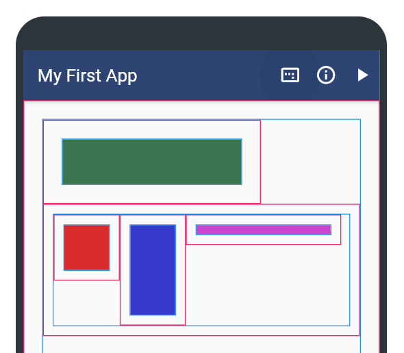
It is often difficult to understand how the size of widgets and especially the margin affects the overall user interface. To address this issue, the app preview offers so-called debug lines. These can be enabled via the icon on the left side of the preview toolbar (). Debug lines have two different colors (see image below). Red lines represent the outer border of the widget including the assigned margin. The blue lines, on the other hand, represent the actual border of the widget. If a widget has no outer space, only the red line is displayed.

